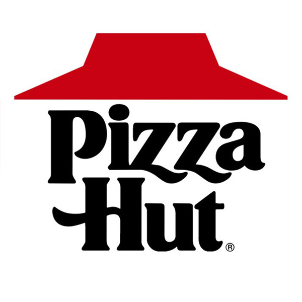
“New” Pizza Hut logo rekindles old feelings
If you grew up in Wichita like we did, chances are Pizza Hut holds a special place in your heart. Originating here in 1958, Pizza Hut is more than just a global fast food goliath to us, it’s a part of our heritage and one of the first things any card-carrying Wichitan mentions to any outsider wanting to learn more about the city.
(Want proof? Just check out the original Pizza Hut/museum on the Wichita State University campus.)
But over the years, Wichita’s relationship to Pizza Hut has become strained at best.
When the company (then owned by PepsiCo) moved its headquarters to Dallas in 1995, the city—and Wichitans like us—felt spurned. On top of that, jobs were lost, families were relocated and a large revenue stream for companies throughout the city instantly dried up.
In the years that have followed, we have been forced to sit back and watch from afar as the company we knew and loved slowly changed. Like many companies looking to maximize profits and market share, Pizza Hut began to water down its DNA (some say literally) in an attempt to appeal to larger audiences and varying palates.

Along with the product changes, came changes to the overall Pizza Hut brand—culminating in 1999 with a drastic update of the iconic red-roof logo that had been in place since 1967.
And just like that, the last semblance of the Pizza Hut we grew up with was suddenly gone—never to be seen again.
Or so we thought.
You see, desperate times call for desperate measures.
And Pizza Hut is desperate.
In the 25 years since Pizza Hut left town and began to focus more and more on mass appeal, its market share has suffered, so much so, that just last year Domino’s officially bumped it from its decades long perch at the top of the pizza world.

So, in an attempt to get its groove back, the company is trying to get back to its roots—starting with bringing back its old logo.
“Embracing our iconic Pizza Hut logo is recognition of a time period where Pizza Hut unequivocally reigned supreme, because that’s where the future is headed,” said Marianne Radley, Pizza Hut’s chief brand officer at the time of the logo’s relaunch.
While from both a nostalgic and design point of view (let’s face it, the old logo is clearly better and more timeless than the garish versions of the early 2000s), we’re thrilled to see the old, familiar face back in our home. Pizza Hut’s recent history is a great example of two important marketing lessons:
- Resist the urge to throw away the equity you have in your existing brand simply because you have new leadership or think you need a “refresh.” Rebranding is hard and unless there is a really, really good reason to do it (it is negatively affecting business or simply doesn’t represent who you are anymore) it should be avoided.
- Don’t try to be all things to all people. In today’s world there is an overwhelming temptation to try to get away from having a strong niche in order to cash in on a mass audience. Doing so gets you away from what you’re really good at doing and what made you successful in the first place.
As Patagonia founder Yvon Chouindard puts it in his book, “Let My People Go Surfing,” “You have to be true to yourself, you have to know your strengths and limitations and live within your means … the sooner a company tries to be what it is not, the sooner it tries to ‘have it all,’ the sooner it will die.”
If you’re from Wichita and have your own take on Pizza Hut or just want to share your thoughts about its recent rebranding efforts, share them below.
Comments
January 23, 2020
So excited they brought the original logo back. You can’t recreate magic.